Why Independent Retailers Need Mobile Friendly Websites
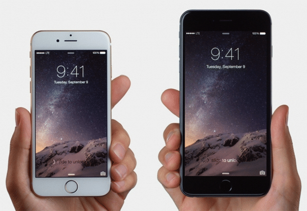
If you haven’t yet seen the writing on the wall, it’s long past due that you open your eyes and look at the world around you – computing has gone mobile, and smartphones, phablets and tablets are here to stay. The iPhone 6 Plus is evidence enough of this, as is the fact that increasingly, providers like T-Mobile are incentivizing users with free limited 4G LTE coverage. Suffice to say, with a sea change in the devices that people use on a daily basis, so too has the Internet browsing experience changed. Increasingly, users are viewing the web from their mobile devices, not their desktop.
It is imperative that businesses looking to stay relevant in the 21st century – particularly independent businesses that may need to rely on craftiness rather than capital resources – have a website that is mobile responsive. Why? Well, it’s important in part because you should tailor your customer’s user experience around the device that he or she will use to access your business’ website. But it’s also important because data has shown it can convert into sales. Point being: go mobile! Here’s how to do so.
The Keys to a Mobile-friendly Site
Perhaps of most importance: design one website and make it work on all devices. The old trick of developing a separate, mobile-specific website that users are redirected to is dead, a relic from a now bygone era. The key is to make your website mobile-responsive, so that it can adapt to the screen in which it fills. As browser sizes change, the elements on your website should change with it; for example, on a tablet, you may want to enlarge the size of buttons and links so that they can be more easily accessed with a finger rather than a mouse. Designing and coding your website so that it is mobile-responsive will enable the site to do this automatically and dynamically, in real time. Of course, you can take other steps as well, including:
Minimize, Downsize and Edit – There’s an old saying in digital marketing circles that when it comes to the Web, “content is king.” And this old adage came about because Google did – and still does – factor on-page and meta content into its search rankings. However, a new hypothesis has taken root over the last several years, which states simply: craft your website around your user’s needs, and Google will follow. When it comes to mobile, this means giving your user less, not more. Remember, mobile users have smaller screens and are spending less time on-site, so don’t waste their time.
Cut to the Chase – Mobile users are users ready to act. Don’t put unnecessary buffers in their way. If your conversion point is filling out a contact form, make that contact form simple and intuitive so that users can easily fill it out using their touch screen’s keyboard. If your conversion point is a checkout process, design it so that users can navigate through it with as few clicks as possible. When it comes to mobile, you must not only think of the user interface, but the user experience as well. Cater to the device, yes, but also to the user. In many cases, mobile users are on the move and looking to accomplish basic tasks quickly. Have clear calls-to-action and simple user flow.
Your Call-to-Action: Don’t Wait, Act Now!
Though independent business owners may not have the resources that large corporations do, they can still do a number of things to make their websites better suited for mobile devices. And with the proliferation of mobile devices well underway, it’s probably a good idea that they do so now. After all, better late than sorry, as the saying goes.
Contributed by Jessica Oaks, www.freshlytechy.com. Follow Oaks at @techyjessy on Twitter.
Photo Credit: Tech Times
What's your reaction?


Best Retail POS Systems f...
Running a small retail business means every decision counts. Your point of sale system is one

Is A Retail Cloud POS Sys...
If you're running a retail store in 2026, chances are you've already heard the case for

How SMS Verification Tool...
In the fast‑moving world of retail, customer trust is essential—not only for driving sales, but also


Jordan E Baker
Really good post, this is some great information which I will pass onto my team!
geoff
Great post in that it highlights the importance of small businesses being mobile friendly. Which doesn’t necessarily mean more work or cost for small businesses. You just need to make sure you are using the right tools. Mobile ecommerce will account for 30% of global ecommerce sales by 2018 and will grow.
A lot of the growth is due to popularity of tablets, 52% of tablet users prefer to shop using tablet than PC. Small businesses do need to ensure that they online store and checkout is mobile friendly, or they will lose sales. 41% of buyers don’t complete a purchase on mobile device because too difficult to enter credit card information, and 47% gave up because checkout process took too long. Personally there is nothing more frustrating than trying to fill in a lot of unnecessary fields on a checkout using a smartphone 🙂